 |
| Image Credit : Pixabay.com |
Bar Graph
↪ A bar graph is a pictorial representation of data in which usually bars of uniform width are drawn with equal spacing between them on one axis (say, the x-axis), depicting the variable.↪ The values of the variable are shown on the other axis (say, the y-axis) and the heights of the bars depend on the values of the variable.
↪ Scale is the quantity we choose to represent through one unit length on the graph .
We can choose any scale on the horizontal axis, since the width of the bar is not important. But for clarity, we take equal widths for all bars and maintain equal gaps in between.
On the vertical axis we choose suitable scale so that the maximum value can be represented on the graph.

ex - Bar graph shows the marks obtained by a student in an examination in different subjects.
We can easily visualise the relative characteristics of the data at a glance, e.g., the marks obtained in Mathematics is more than that of Science.
Histogram
↪ Graphical representation of a grouped frequency distribution with continuous classes is called Histogram.This is a form of representation like the bar graph, but it is used for continuous class intervals.

If the first class interval is not starting from zero, we show it on the graph by marking a kink or a break on the axis.
↪ We represent frequencies on the vertical axis on a suitable scale.We need to choose the scale to accommodate the maximum frequency.
↪ We draw rectangles (or rectangular bars) of width equal to the class-size and lengths according to the frequencies of the corresponding class intervals.
Since there are no gaps in between consecutive rectangles, the resultant graph appears like a solid figure.
↪ Unlike a bar graph, the width of the bar plays a significant role in its construction.
↪ Areas of the rectangles erected are proportional to the corresponding frequencies. Greater the area, greater the frequency.
A ∝ f
A1 ∶A2 ∶A3 ... = f1 ∶f2 ∶f3 ...
L1B1 ∶L2B2 ∶L3B3 ... = f1 ∶f2 ∶f3 ...
L1 ∶L2 ∶L3 ... = f1 ∶f2 ∶f3 ...
(If B1,B2,B3,... are equal)
L ∝ f
Most often, the Class-size are all equal, therefore the widths of the rectangles are all equal, hence the lengths of the rectangles are proportional to the frequencies. That is why, we draw the lengths according to the frequency.
When Class intervals are of different size :
The areas of the rectangles are proportional to the frequencies in a histogram.
A1 ∶A2 ∶A3 ... = f1 ∶f2 ∶f3 ...
L1B1 ∶L2B2 ∶L3B3 ... = f1 ∶f2 ∶f3 ...
∵ B1,B2,B3,... are not equal
L1 ∶L2 ∶L3 ... ≠ f1 ∶f2 ∶f3 ...
So, we need to make certain modifications in the lengths of the rectangles so that the areas again become proportional to the frequencies.
↪ Select a class interval with the minimum class size, B0. (A0 =L0×B0)
↪ The lengths of the rectangles are then modified to be proportionate to the class-size B0.
A1 ∶A0 = f1 ∶f0
L1 × B1 ∶ L0×B0 = f1 ∶ f0
(∵ L0 = f0)
L1 × B1 ∶ B0 = f1
L1∶ f1= B0 ∶ B1
L1 = B0×f1 ∶ B1
↪ Similarly, other lengths can be find in this manner. We may call these lengths as “proportion of variables per B0 marks interval”
Example : A teacher wanted to analyse the performance of two sections of students in a mathematics test of 100 marks. Looking at their performances, she found that a few students got under 20 marks and a few got 70 marks or above. So she decided to group them into intervals of varying sizes as follows: 0 - 20, 20 - 30, . . ., 60 - 70, 70 - 100. Then she formed the following table:


Here, length of two rectangles of class-interval 0-20 & 70-100 needs to be corrected.
L1 = B0×f1 ∶ B1
L0-20 = 10×7 ∶ 20 = 3.5
L70-100 = 10×8 ∶ 30 = 2.67


Frequency Polygon
A Frequency Polygon is a pictorial representation of quantitative data and its frequencies by a polygon. A frequency polygon is very similar to a histogram, the surface under the frequency polygon is exactly the same as the surface of the histogram.

↪ Frequency polygons are similar to line graphs. They are used when the data is continuous and very large. It is very useful for comparing two different sets of data of the same nature, for example, comparing the performance of two different sections of the same class.
Class-marks
The mid-points of the class-intervals are called class-marks.To find the class-mark of a class interval, we find the sum of the upper limit and lower limit of a class and divide it by 2.
Class-mark = (Upper limit + Lower limit)/2
Frequency polygons can also be drawn independently without drawing histograms. It can be drawn by plotting the class-marks along the horizontal axis, the frequencies along the vertical-axis, and then plotting and joining the data points(x,y) by line segments.
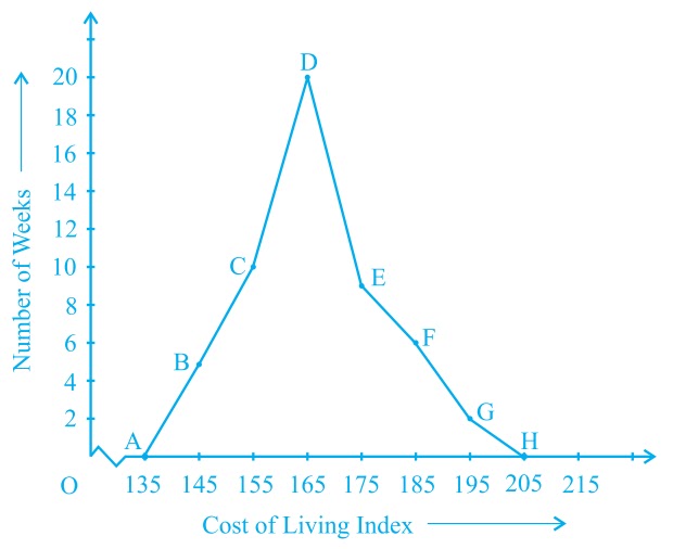
Ex - In a city, the weekly observations made in a study on the cost of living index are given in the following table:

Sol -
First we find class-marks of all classes and obtain a table as following,

We should plot the point corresponding to the class-mark of the class 130 - 140 (just before the lowest class 140 - 150) with zero frequency, that is A(135, 0), and the point H (205, 0) occurs immediately after G(195, 2). So, the resultant frequency polygon will be ABCDEFGH.
| Statistics: Introduction & Tabular Presentation | |